Most artists like the freedom of creating whatever they damn well please, however they please. But to communicate effectively in a visual medium, a little learning is a good thing. There are rules for composition, and design elements to consider. Remember though, some of the best art breaks at least one of the rules, but probably not all of them.
Marvin Bartel speaks of composition and design from a teacher's perspective. It all boils down to what you want to emphasize in the work and how to present it cohesively. As an artist, you must consider the viewer and direct the viewer's eye.
Meaning in art can be elusive. It's pretty clear in Goya's "The Third of May, 1808" what the artist intended.
Van Gogh's rapture is pretty clear in "Starry Night." Note that the Moon isn't in the center of the image; it's almost off the edge. What is in the center is the flow. The trees act as a counterpoint to the Moon.
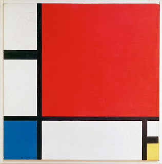
But what do you take away from viewing Mondrian's "Composition II in Red, Blue, and Yellow"?
Seems to me that some works are done with a message in mind or result in having a message, but some may be just eye candy (or they may have messages few can interpret). If you have something to say that is larger than what you're working on, that needs to be practiced too. For an excellent discussion of meaning in art, check out this from a forum at xkcd.
-- Marge
Marvin Bartel speaks of composition and design from a teacher's perspective. It all boils down to what you want to emphasize in the work and how to present it cohesively. As an artist, you must consider the viewer and direct the viewer's eye.
Meaning in art can be elusive. It's pretty clear in Goya's "The Third of May, 1808" what the artist intended.
***
***
Van Gogh's rapture is pretty clear in "Starry Night." Note that the Moon isn't in the center of the image; it's almost off the edge. What is in the center is the flow. The trees act as a counterpoint to the Moon.
***
***
But what do you take away from viewing Mondrian's "Composition II in Red, Blue, and Yellow"?
***
 |
| Piet Mondriaan, "Composition II in Red, Blue, and Yellow, Wikipedia |
***
Seems to me that some works are done with a message in mind or result in having a message, but some may be just eye candy (or they may have messages few can interpret). If you have something to say that is larger than what you're working on, that needs to be practiced too. For an excellent discussion of meaning in art, check out this from a forum at xkcd.
-- Marge

No comments:
Post a Comment