Continuing with the previous post about YouTube One Channel art, today we will be adding text.
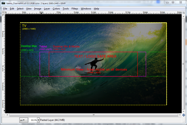
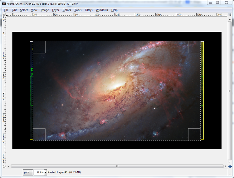
After opening the GIMP file and before starting to use the text tool, show the template layer by clicking on the eye in "Pasted Layer" ("Layers - Gradients" panel). To use the template for sizing and positioning the text as desired, set the visibility to about 25%. The Opacity control is near the top of the panel, just above the Lock button. (Remember that the content has been merged with the background.)
Invoke the text editor by clicking on Toolbox/"Text Tool" (A big letter A about 11 rows down). Click in the image area and type a word or two, then hold down your shift key and arrow back over what you just typed to select it. In the "Change size of selected text" (instruction seen when you mouse over the input field), enter or select the size you want. I set mine at 100 pixels. In the "Change font of selected text" field, type the first letter of the font desired and a dropdown of available fonts will show. If you want to see more of the available fonts, backspace (in the select field) and type in another letter. The number of fonts available will depend on what you have installed on your computer. Because I have a number of graphics programs, my list is extensive. If you can't find a font you want to use, fonts are available online to buy or download free.
Selecting a font that suits the work can be challenging. I finally settled on AdLib WGL4 BT. To exit the "Text Tool," select another tool -- the "Rectangle Select Tool" is probably the safest choice. To revise your text, reselect the "Text Tool" and highlight the text once again.
To position the text, select Toolbox/"Move Tool." After checking that you have the layer with the text you want to position selected, place your cursor directly over the text, click and drag. If you accidentally move the layer beneath, Ctrl+z will fix it. My text is in two separate layers so that each can be positioned separately.
With the text layer selected you can add a drop shadow by selecting Filters/"Light and Shadow"/"Drop Shadow." A dialogue appears. I set the Offset X and Offset Y to zero, the blur radius to 45, opacity to about 70%, and the color gold for the effect you see below.

With the Offset X and Offset Y set to 10, the blur radius to 12, opacity at 50%, and the color bright green selected, you see the effect below.

Note that you can copy a drop shadow to another layer with Filters/"Repeat 'Drop Shadow'." Also you can revise the drop shadow with Filters/"Re-Show 'Drop Shadow'." Be aware that each time you revise a drop shadow a new sub-layer is made for that text layer. The sub-layers can be deleted by right-clicking and selecting "Delete Layer."
This is what the work looks like now, with template. Notice that the text isn't exactly centered. I'm not sure whether this will work or not, but will have to wait to test it.

To export to a file format that can be posted, begin by hiding the template (click the eye on "Pasted Layer." Now select File/"Export to..." The default file format is "dot png" and a good choice. Accept the options (they're OK) offered by clicking "Export." This is the final product:

Seems to me the content should be blended a little better and corners rounded, but that's a topic for another day.
-- Marge
After opening the GIMP file and before starting to use the text tool, show the template layer by clicking on the eye in "Pasted Layer" ("Layers - Gradients" panel). To use the template for sizing and positioning the text as desired, set the visibility to about 25%. The Opacity control is near the top of the panel, just above the Lock button. (Remember that the content has been merged with the background.)
Invoke the text editor by clicking on Toolbox/"Text Tool" (A big letter A about 11 rows down). Click in the image area and type a word or two, then hold down your shift key and arrow back over what you just typed to select it. In the "Change size of selected text" (instruction seen when you mouse over the input field), enter or select the size you want. I set mine at 100 pixels. In the "Change font of selected text" field, type the first letter of the font desired and a dropdown of available fonts will show. If you want to see more of the available fonts, backspace (in the select field) and type in another letter. The number of fonts available will depend on what you have installed on your computer. Because I have a number of graphics programs, my list is extensive. If you can't find a font you want to use, fonts are available online to buy or download free.
Selecting a font that suits the work can be challenging. I finally settled on AdLib WGL4 BT. To exit the "Text Tool," select another tool -- the "Rectangle Select Tool" is probably the safest choice. To revise your text, reselect the "Text Tool" and highlight the text once again.
To position the text, select Toolbox/"Move Tool." After checking that you have the layer with the text you want to position selected, place your cursor directly over the text, click and drag. If you accidentally move the layer beneath, Ctrl+z will fix it. My text is in two separate layers so that each can be positioned separately.
With the text layer selected you can add a drop shadow by selecting Filters/"Light and Shadow"/"Drop Shadow." A dialogue appears. I set the Offset X and Offset Y to zero, the blur radius to 45, opacity to about 70%, and the color gold for the effect you see below.
With the Offset X and Offset Y set to 10, the blur radius to 12, opacity at 50%, and the color bright green selected, you see the effect below.
Note that you can copy a drop shadow to another layer with Filters/"Repeat 'Drop Shadow'." Also you can revise the drop shadow with Filters/"Re-Show 'Drop Shadow'." Be aware that each time you revise a drop shadow a new sub-layer is made for that text layer. The sub-layers can be deleted by right-clicking and selecting "Delete Layer."
This is what the work looks like now, with template. Notice that the text isn't exactly centered. I'm not sure whether this will work or not, but will have to wait to test it.

To export to a file format that can be posted, begin by hiding the template (click the eye on "Pasted Layer." Now select File/"Export to..." The default file format is "dot png" and a good choice. Accept the options (they're OK) offered by clicking "Export." This is the final product:

Seems to me the content should be blended a little better and corners rounded, but that's a topic for another day.
-- Marge